
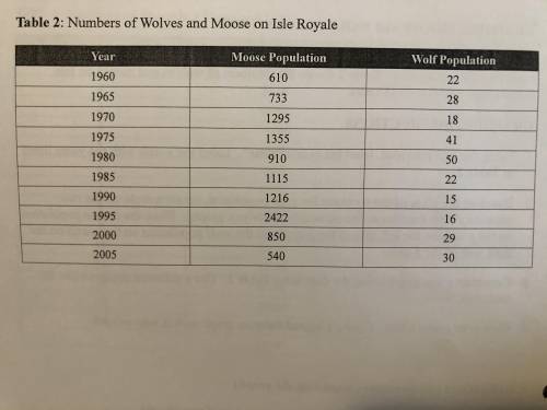
Biology, 27.03.2021 17:00 shyanne9364
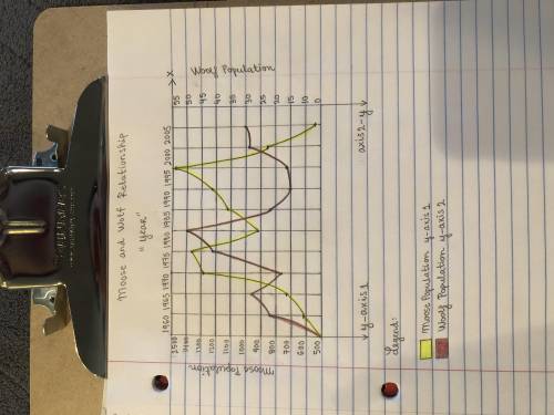
1. Using the grid provided, label the x-axis “Year". Label the x-axis with the years listed in picture one below.
2. Based on the sizes of the numbers for each population, create a scale on the two separate y-axes (similar to the snowshoe hare-lynx graph). Place the moose population on the y-axis on the left side of the x-axis and the wolf population on the y-axis on the right side of the x-axis.
3. Construct a line graph using the data from Table 2. Use a different coloured line for each population.
4.Give your graph a title. Create a legend for your graph so it is easy to read.
after your done with graph please answer this questions!
1. Describe the relationship between the moose and wolf populations.
2. What biotic and abiotic factors might influence the moose and wolf populations?
3.How would the carrying capacity for wolves be influenced if a large number of moose were killed by humans?
also please make sure the grid your using is the same as in picture two below!


Answers: 2
Another question on Biology
Biology, 21.06.2019 19:30
The diagram below represents a marine food web and a process that can harm the human population. each circle represents an organism and the smaller dots inside them represent a toxic substance. what is being represented and how does it harm the population? the diagram represents biological half-life, in which toxins build up in organisms higher up on the food chain, and this can negatively impact humans who consume the organisms and the toxic substance. the diagram represents biomagnification, in which toxins build up in organisms higher up on the food chain, and this can negatively impact humans who consume the organisms and the toxic substance. the diagram represents the process by which different organisms prey upon each other; this can impact the human population by reducing the number of organisms that do not contain the toxin. the diagram represents the way that toxins are metabolized by living organisms, with those at greater trophic levels able to metabolize more efficiently than those at lower levels. this means that those at higher tropic levels are safer for humans to consume compared to the organisms at lower trophic levels.
Answers: 1
Biology, 22.06.2019 08:40
Where does the information about where each transcription factor binds originate?
Answers: 1
Biology, 22.06.2019 09:00
In an experiment examining the effects tai chi on arthritis pain, callahan (2010) selected a large sample of individuals with doctor-diagnosed arthritis. half of the participants immediately began a tai chi course and the other half (the control group) waited 8 weeks before beginning. at the end of 8 weeks, the individuals who had experienced tai chi had less arthritis pain that those who had not participated in the course.
Answers: 1
You know the right answer?
1. Using the grid provided, label the x-axis “Year". Label the x-axis with the years listed in pictu...
Questions

Mathematics, 19.10.2021 01:00


English, 19.10.2021 01:00


Arts, 19.10.2021 01:00


Mathematics, 19.10.2021 01:00
Mathematics, 19.10.2021 01:00
Mathematics, 19.10.2021 01:00


