
Mathematics, 20.11.2019 06:31 sunshine52577oyeor9
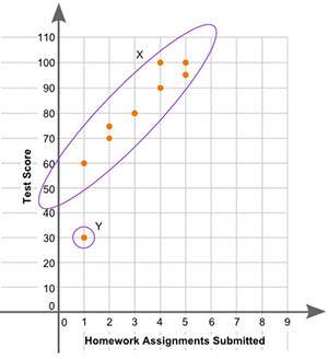
The scatter plot shows the relationship between the number of homework assignments turned in over a week and the test score for that same week:
part a: what is the group of points labeled x called? what is the point labeled y called? give a possible reason for the presence of point y. (3 points)
part b: describe the association between a student’s test scores and the number of homework assignments submitted. (2 points)

Answers: 1
Another question on Mathematics
Mathematics, 21.06.2019 14:50
Which best describes the strength of the correlation, and what is true about the causation between the variables? it is a weak negative correlation, and it is not likely causal. it is a weak negative correlation, and it is likely causal. it is a strong negative correlation, and it is not likely causal. it is a strong negative correlation, and it is likely causal.
Answers: 1
Mathematics, 21.06.2019 19:40
Which system of linear inequalities is represented by the graph?
Answers: 1
You know the right answer?
The scatter plot shows the relationship between the number of homework assignments turned in over a...
Questions

Mathematics, 08.06.2021 09:50
Mathematics, 08.06.2021 09:50
Mathematics, 08.06.2021 09:50
Mathematics, 08.06.2021 14:00


Mathematics, 08.06.2021 14:00
Mathematics, 08.06.2021 14:00

Chemistry, 08.06.2021 14:00

Physics, 08.06.2021 14:00
Mathematics, 08.06.2021 14:00
Mathematics, 08.06.2021 14:00


