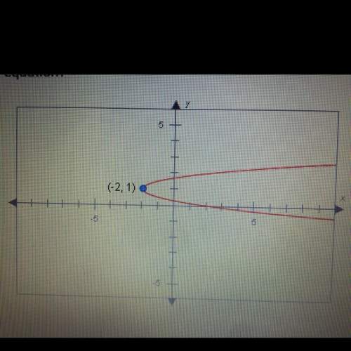
The dot plot below shows the hourly rate of some babysitters in a city:
a number line is show...

Mathematics, 01.08.2019 00:10 issagirl05
The dot plot below shows the hourly rate of some babysitters in a city:
a number line is shown from 1 dollar to 5 dollars in increments of 1 dollar for each tick mark. the horizontal axis label is dollar per hour. there are 4 dots above 2 dollars, 2 dots above 3 dollars, 3 dots above 4 dollars, and 1 dot above 5 dollars. the title of the line plot is babysitting rates.
which statement best describes the shape of the data?
it is symmetric and has a peak at $5.00.
it is not symmetric and has a peak at $2.00.
it is a cluster from $1.00 to $5.00 and has gaps.
it is a cluster from $1.00 to $5.00 and has no gaps.

Answers: 3
Another question on Mathematics
Mathematics, 21.06.2019 12:30
Anna is no more than 3 years older than 2 times jamie’s age. jamie is at least 14 and anna is at most 35. which system of linear inequalities can be used to find the possible ages of anna, a, and jamie, j?
Answers: 2
Mathematics, 21.06.2019 15:40
What is the first quartile of this data set? 10, 11, 12, 15, 17, 19, 22, 24, 29, 33, 38 a. 12 b. 19 c. 29 d. 10
Answers: 1
Mathematics, 21.06.2019 16:00
Given right triangle xyz, which correctly describes the locations of the sides in relation to
Answers: 1
Mathematics, 21.06.2019 16:00
Part one: measurements 1. measure your own height and arm span (from finger-tip to finger-tip) in inches. you will likely need some from a parent, guardian, or sibling to get accurate measurements. record your measurements on the "data record" document. use the "data record" to you complete part two of this project. name relationship to student x height in inches y arm span in inches archie dad 72 72 ginelle mom 65 66 sarah sister 64 65 meleah sister 66 3/4 67 rachel sister 53 1/2 53 emily auntie 66 1/2 66 hannah myself 66 1/2 69 part two: representation of data with plots 1. using graphing software of your choice, create a scatter plot of your data. predict the line of best fit, and sketch it on your graph. part three: the line of best fit include your scatter plot and the answers to the following questions in your word processing document 1. 1. which variable did you plot on the x-axis, and which variable did you plot on the y-axis? explain why you assigned the variables in that way. 2. write the equation of the line of best fit using the slope-intercept formula $y = mx + b$. show all your work, including the points used to determine the slope and how the equation was determined. 3. what does the slope of the line represent within the context of your graph? what does the y-intercept represent? 5. use the line of best fit to you to describe the data correlation.
Answers: 2
You know the right answer?
Questions

English, 19.06.2021 22:50
English, 19.06.2021 22:50


Computers and Technology, 19.06.2021 23:00
Mathematics, 19.06.2021 23:00
English, 19.06.2021 23:00
Mathematics, 19.06.2021 23:00
Health, 19.06.2021 23:00

Advanced Placement (AP), 19.06.2021 23:00


