
Biology, 10.12.2020 02:20 thicklooney
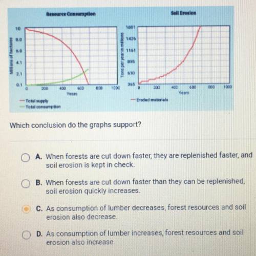
The graph on the left shows the supply and consumption of forests when the
consumption rate and population growth rate are both low. The graph on the
right shows soil erosion under the same conditions.
Which conclusion do the graphs support?
A. When forests are cut down faster, they are replenished faster, and
soil erosion is kept in check.
B. When forests are cut down faster than they can be replenished,
soil erosion quickly increases.
C. As consumption of lumber decreases, forest resources and soil
erosion also decrease.
D. As consumption of lumber increases, forest resources and soil
erosion also increase.

Answers: 3
Another question on Biology
Biology, 22.06.2019 06:30
Study the picture of the ocean. which is the best example of an organism’s niche shown in the picture? a. the environment contains several of the same species of coral. b. the shallow area of the ocean meets the needs of the coral and the fish. c. the ocean has fish and coral that live in the same area. d. the coral take in food from the water and provide shelter for the fish.
Answers: 2
Biology, 22.06.2019 07:30
Answer ! in your opinion, what are the limiting factors that might affect the growth or diversity of our ecosystem? respond to this question in claim, evidence, reasoning format. 1. make your claim (i are the limiting factors that might affect the growth or diversity of our 2. follow the claim with 3 pieces of evidence. evidence may be taken from the reading, the videos, previous lessons, or googled answers. site sources, too. 3. use reasoning to explain why you chose your evidence.
Answers: 2
Biology, 22.06.2019 10:30
Which label correctly identifies what x represents in the concept map?
Answers: 2
Biology, 22.06.2019 14:00
True or false: (a) the strings of little red dots represent carbohydrates. (b) the model is called a bilayer because there are two main types of molecules present, lipids and proteins. (c) the many black lines represent amino acid tails. (d) this model shows membrane transport. (e) the blue ovals are hydrophobic. (f) the blue ovals represent phospholipid heads.
Answers: 1
You know the right answer?
The graph on the left shows the supply and consumption of forests when the
consumption rate and pop...
Questions

Mathematics, 14.12.2021 05:30
Mathematics, 14.12.2021 05:30

English, 14.12.2021 05:30

Chemistry, 14.12.2021 05:30
Mathematics, 14.12.2021 05:30
Biology, 14.12.2021 05:30
Mathematics, 14.12.2021 05:30


History, 14.12.2021 05:30
English, 14.12.2021 05:30

Spanish, 14.12.2021 05:30
Mathematics, 14.12.2021 05:30
Mathematics, 14.12.2021 05:30
Mathematics, 14.12.2021 05:30
Mathematics, 14.12.2021 05:30
Business, 14.12.2021 05:30

Computers and Technology, 14.12.2021 05:30


